An illumination on PANTONE’s Color of the Year.
January 14, 2021 // Creative Coffee Break
Who is PANTONE?
Since 1968, designers around the world have heralded the revolutions in color from PANTONE, the global authority on color. PANTONE has helped to standardize colors in the commercial printing space by meticulously producing color formulas via its patented PANTONE MATCHING SYSTEM. For non-designers, think of it like walking into any paint store, selecting a paint swatch and getting an exact match in gloss, satin or matte finish.
For years, designers and commercial printers alike have relied on their chip charts and swatch books to ensure that “what you see is what you get.” Today, PANTONE’s reach is much further than the commercial printing space. It has standardized colors for digital, textiles, plastics and even 3D printing — so no matter where your brand is being represented (or on what), its color is accurate.
PANTONE Color of the Year: What it is and isn’t.
In 2000, PANTONE introduced the Color of the Year to the world. It was its way of forecasting the one color that would make a wave through the creative, marketing and retail worlds. Now, PANTONE is a huge (if not the biggest) influencer in color trends. From high fashion to retail goods, its color forecast influences what shades we’ll see on shelves each year — even what color your next iPhone might be.
The Color of the Year is not intended to influence your company’s branding. You shouldn’t change your company’s logo or adjust your color palette. However, if you are producing things that either hit a consumer shelf or website for sale (like a ready-to-use design template), you could consider using PANTONE’s Color of the Year as an option. But that doesn’t mean you can’t use these colors in your marketing efforts. Keep reading for more information on that.
Revealing the 2021 PANTONE Color of the Year.
So, with an unprecedented year, PANTONE’s chose a bit of an unprecedented response. For the first time, it’s chosen two colors AND included a neutral — Ultimate Gray — as part of its color of the year duo, along with the bright yellow Illuminating. Here’s PANTONE’s reasoning:
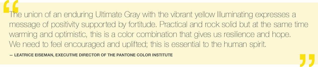
There’s been an interesting response to PANTONE’s choices — some welcoming the pivot, some calling it cheating for using two colors. But upon reflection, because color influences mood, and PANTONE seeks to inspire strength and positivity, it fits with the times. Strength and positivity are two things everyone is yearning for in 2021. Even from a business perspective, this message rings true.
How to use it in your marketing efforts.
While you shouldn’t adjust your brand to fit the Color of the Year, there are ways to incorporate it gracefully into marketing if you so choose. But remember to always keep your main branding in mind.
Here are a few options to consider:
- Presentations. Maybe you have a presentation that needs a little extra “wow.” Use a storytelling approach with large, full-frame photography with a word or sentence over it. And with this year’s color being so impactful, choosing photography with yellow and gray hues could help garner the attention you’re looking for rather than another sleepy presentation.
- Campaign creative. Consider yellow and gray accessories for talent or backgrounds to make your sets feel more timely. From a vase of vibrant yellow flowers, a luxurious gray cashmere sweater, or a cozy gray couch with a textured yellow throw blanket, you can easily weave in a few things to embrace this trend.
- Social media. There is nothing more fleeting than social media. Consider using photography that has more yellows and grays if it works within your plan.
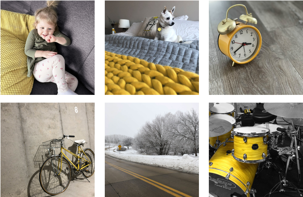
And to give you some inspiration, our team pulled together a few snapshots from home to leave you with. Photos that capture the mood of these two colors — and of 2020 and 2021.
If your creative or marketing efforts need to be updated, reexamined or infused with new energy, give us a shout.
This article was published before January 2024 and does not reflect the consolidation of Performance Marketing, Vector Haus, and Blue Traffic into Anthologic.